CRM LAB - Customer Relationship Management Platform
Simplifying Customer Relationship Management

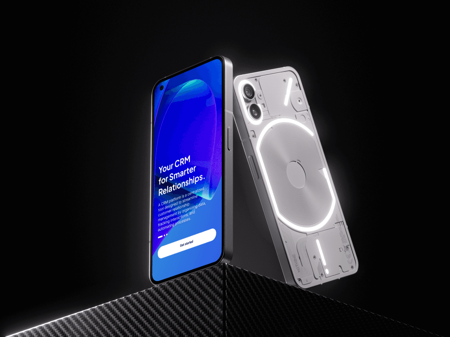
CRM LAB - Customer Relationship Management Platform
Simplifying Customer Relationship Management


Services
Platform Design
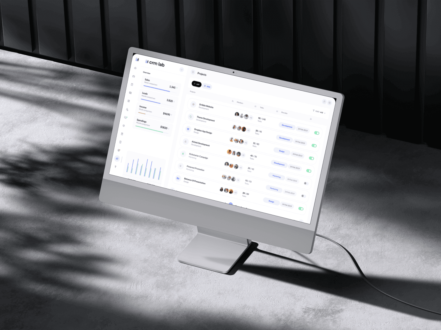
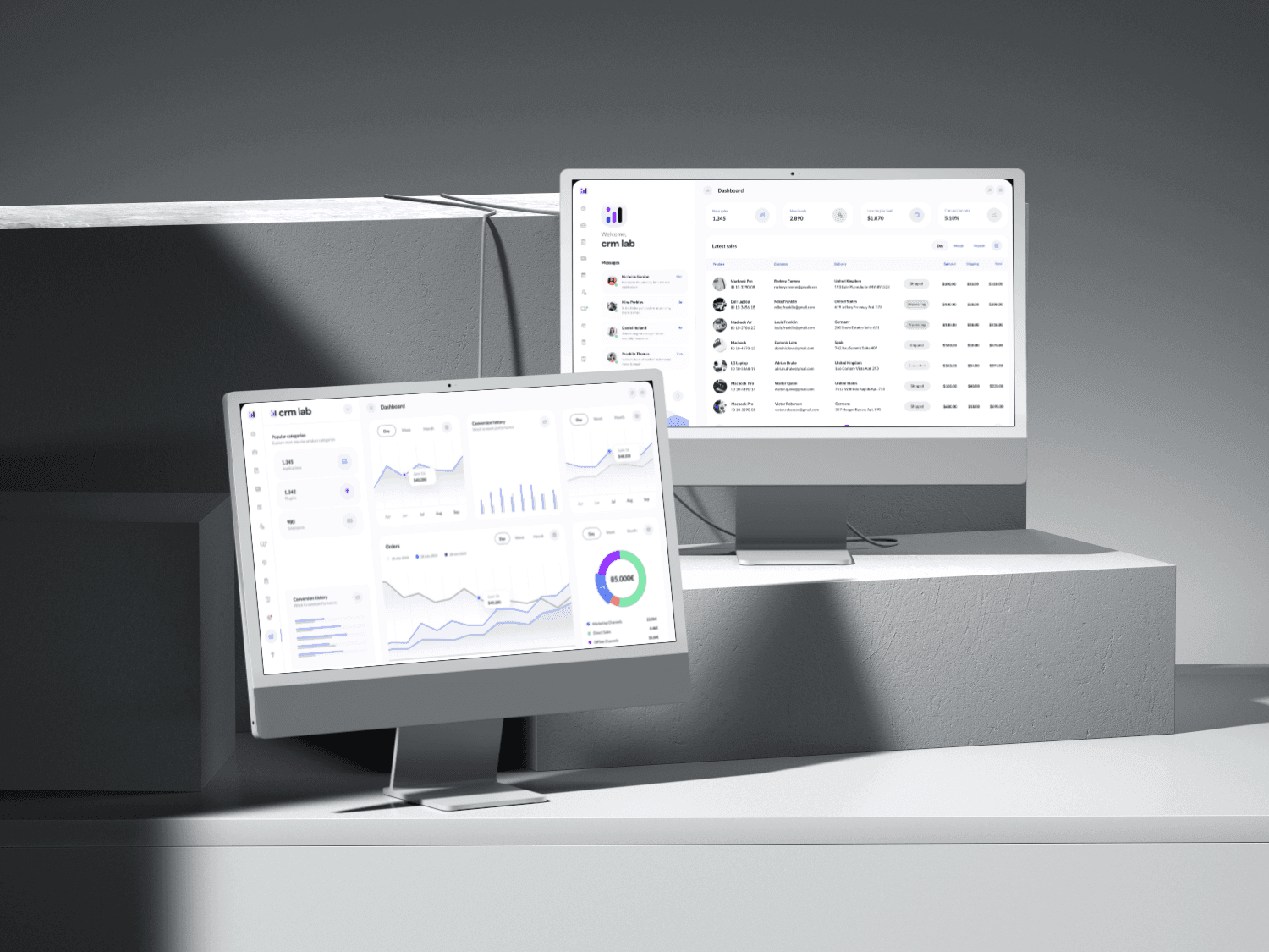
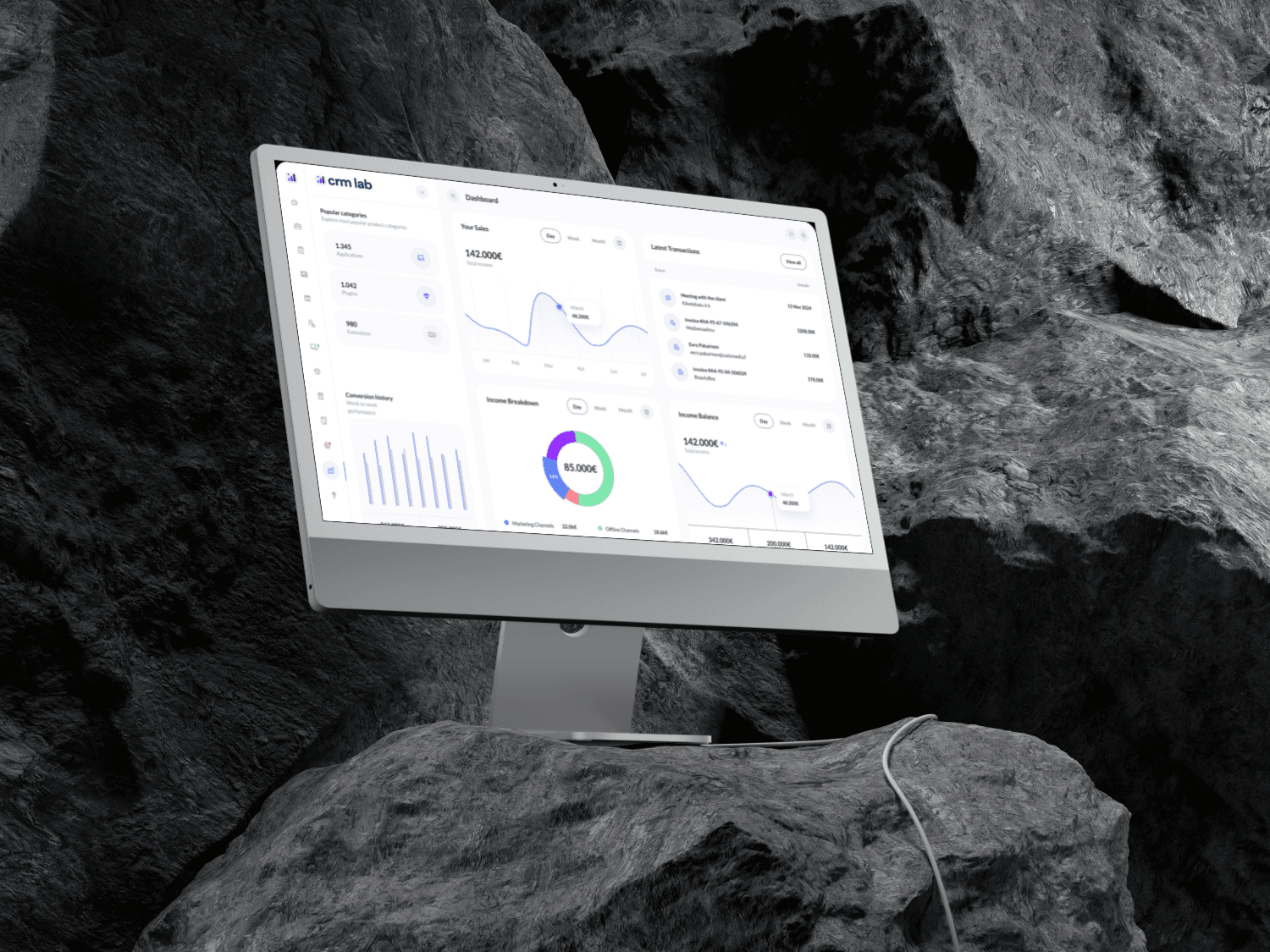
Application's Dashboard Design
Service Overview
I was tasked with redesigning a CRM platform to make it more user-friendly. Users found existing CRMs overwhelming and time-consuming, so our goal was to create something that felt intuitive and efficient.
Challenge
Too much data was causing confusion
Basic tasks required too many clicks
Finding important information was difficult
Charts and graphs weren't helpful enough
Our Design Solution
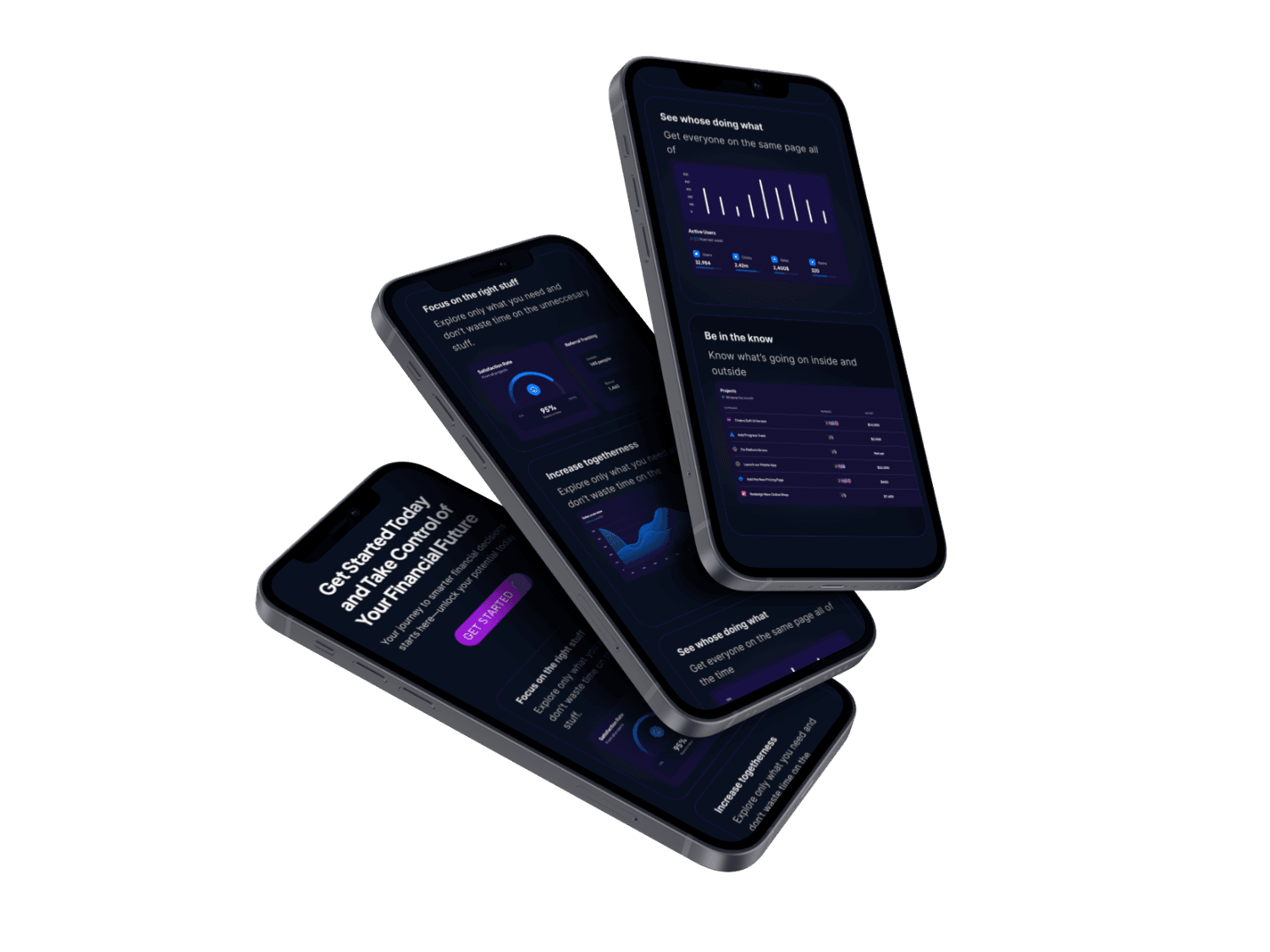
Clean Dashboard
Created customizable cards for different types of information
Used clear headings and spacing to organize content
Added color highlights for important updates
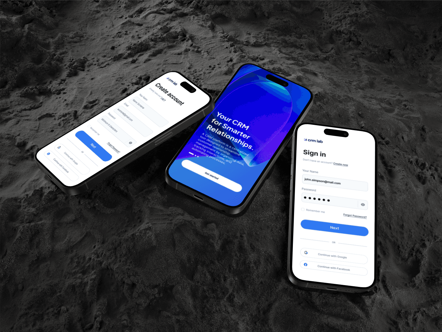
Made it work smoothly on all devices
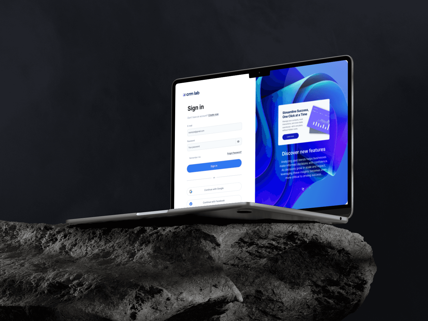
Easier Data Input
Simplified forms to include only what's necessary
Added smart autocomplete features
Made it possible to edit directly on the page
Included clear error messages
Better Visualizations
Used simple, clear colors for different data types
Made charts interactive
Added easy filtering options
Ensured everything was accessible
Results
Most new users made their first investment
Fewer people needed help
Users felt more confident
People kept using the app longer
Main Features
Personal dashboard
Easy search
Simple buy/sell buttons
Built-in learning tools
Our Design Solution
Clean Dashboard
Created customizable cards for different types of information
Used clear headings and spacing to organize content
Added color highlights for important updates
Made it work smoothly on all devices
Easier Data Input
Simplified forms to include only what's necessary
Added smart autocomplete features
Made it possible to edit directly on the page
Included clear error messages
Better Visualizations
Used simple, clear colors for different data types
Made charts interactive
Added easy filtering options
Ensured everything was accessible
Results
Tasks now take 40% less time
85% of users say it's easy to use
More people are discovering and using features
Teams are getting better insights from their data
Next Steps
Adding more advanced charts
Improving the mobile experience
Creating better reporting tools
Adding team collaboration features
Lessons Learned
Early user testing revealed the need for more granular data filters
Regular feedback sessions helped refine interaction patterns
Accessibility considerations from the start prevented major redesigns
Design system implementation dramatically improved development velocity
Description
Wireframes
CJM
Hign-fidelity prototypes
Description
Wireframes
CJM
Hign-fidelity prototypes
04
Branding
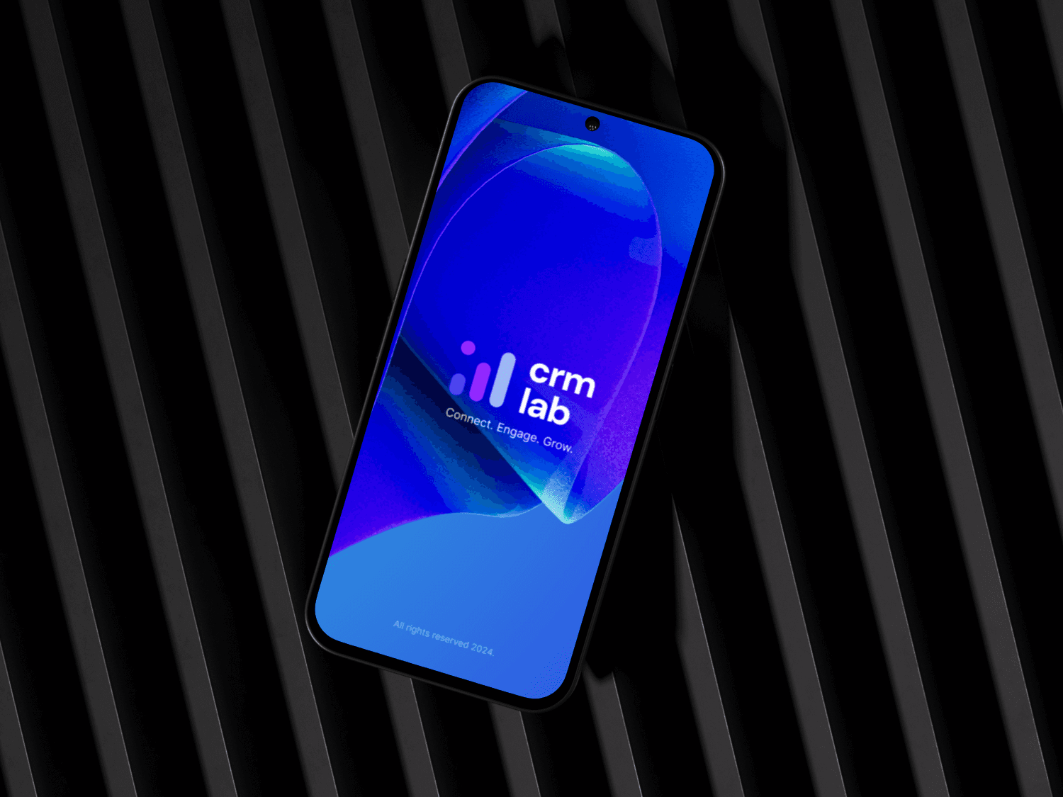



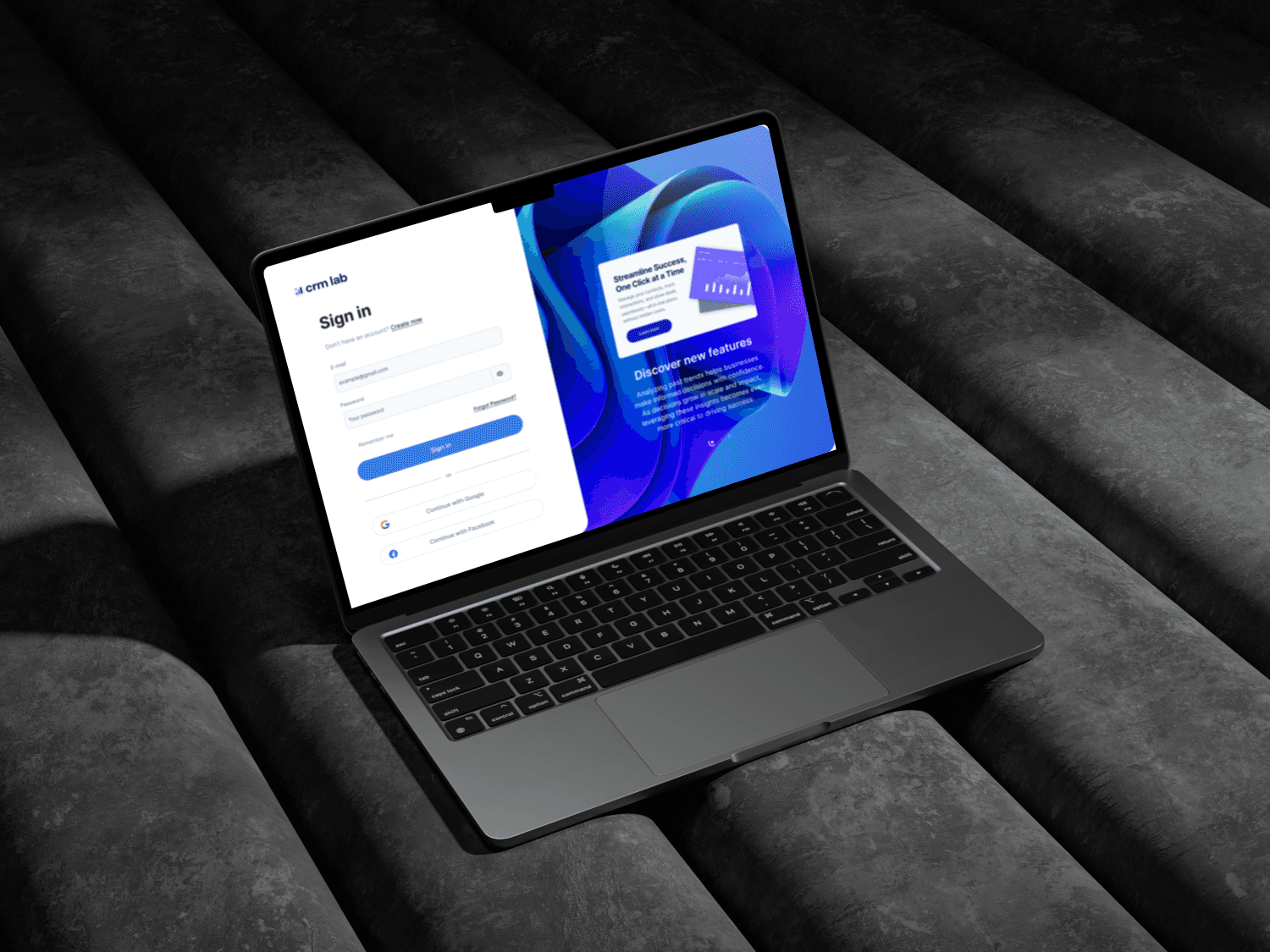



04
Branding


What’s next?
What’s next?
CRM LAB - Customer Relationship Management Platform
Simplifying Customer Relationship Management


CRM LAB - Customer Relationship Management Platform
Simplifying Customer Relationship Management


Services
Webdesign
Copywriting
Service Overview
I was tasked with redesigning a CRM platform to make it more user-friendly. Users found existing CRMs overwhelming and time-consuming, so our goal was to create something that felt intuitive and efficient.
Challenge
Too much data was causing confusion
Basic tasks required too many clicks
Finding important information was difficult
Charts and graphs weren't helpful enough
Our Design Solution
Clean Dashboard
Created customizable cards for different types of information
Used clear headings and spacing to organize content
Added color highlights for important updates
Made it work smoothly on all devices
Easier Data Input
Simplified forms to include only what's necessary
Added smart autocomplete features
Made it possible to edit directly on the page
Included clear error messages
Better Visualizations
Used simple, clear colors for different data types
Made charts interactive
Added easy filtering options
Ensured everything was accessible
Results
Most new users made their first investment
Fewer people needed help
Users felt more confident
People kept using the app longer
Main Features
Personal dashboard
Easy search
Simple buy/sell buttons
Built-in learning tools
Results
Tasks now take 40% less time
85% of users say it's easy to use
More people are discovering and using features
Teams are getting better insights from their data
Next Steps
Adding more advanced charts
Improving the mobile experience
Creating better reporting tools
Adding team collaboration features
Lessons Learned
Early user testing revealed the need for more granular data filters
Regular feedback sessions helped refine interaction patterns
Accessibility considerations from the start prevented major redesigns
Design system implementation dramatically improved development velocity








What’s next?
What’s next?
